

Web Notes
2016.08.20
Using Liquid in Jekyll - Live with Demos
Liquid is a simple template language that Jekyll uses to process pages for your site. With Liquid you can output complex contents without additional plugins.
Josh Comeau recently summarized The Rules of Margin Collapse, here is just my understanding and thoughts.
In CSS world, adjacent margins can sometimes overlap, which is known as “margin collapse”. The basic stuff need to know about it1:
Margin collapsing only happens in the block-direction. This is true even if you change the writing-mode or use logical properties.
The largest margin “wins”.
Any element in between will nix the collapsing (if we’re talking about within-parent collapsing, even a bit of padding or border will be the in-between thing and prevent the collapsing).
Here’s a typical example, involving two sibling paragraphs:
<style>
  p {
    margin-top: 24px;
    margin-bottom: 24px;
  }
</style>

<p>Paragraph One</p>
<p>Paragraph Two</p>
Instead of sitting 48px between the two paragraphs, their 24px margins merge together, occupying the same margin space.
In real-world projects, this kind of margin collapse may happen as desired, or they collapse in weird and unexpected ways. We need to understand the rules behind this collapsing mechanism, then it becomes a lot clearer and less surprising.
In the early days, CSS wasn’t intended to be used for layouts. The people writing the spec were imaging headings and paragraphs (vertically), not columns and sidebars. So we meet our first rule: only vertical margins collapse.
<style>
  p {
    display: inline-block;
    margin-left: 24px;
    margin-right: 24px;
  }
</style>

<p>P1</p>
<p>P2</p>
If you try the above snippet, margin between P1 and P2 will be 48px.
CSS gives us the power to switch our writing modes, so that block-level elements stack horizontally instead of vertically. In this way, the margin collapse rule flips: now, horizontal margins collapse, and vertical margins don’t.
<style>
  html {
    writing-mode: vertical-lr;
  }

  p {
    display: block;
    margin-block-start: 24px;
    margin-block-end: 24px;
  }
</style>

<p>P1</p>
<p>P2</p>
It’s more accurate to adjust our first rule: block-direction margins collapse.
It is somewhat common to use the <br /> tag to increase space between block elements.
<style>
  p {
    margin-top: 32px;
    margin-bottom: 32px;
  }
</style>
<p>Paragraph One</p>
<br />
<p>Paragraph Two</p>
Regrettably, this has an adverse effect on our margins. Although the <br /> tag is invisible and empty, but any element between two others will block margins from collapsing.
Elements need to be adjacent in the DOM for their margins to collapse.
What about when the margins are asymmetrical? Say, the top element wants 72px of space below, while the bottom element only needs 24px?
In this case, the bigger number wins.
Alright, here’s where it starts to get weird.
<style>
  p {
    margin-top: 48px;
    margin-bottom: 48px;
  }
</style>
<div>
  <p>Paragraph One</p>
</div>
<p>Paragraph Two</p>
Here we’re wrapping our first paragraph into a containing <div>, but the margins will still collapse!
How can this be? Well, it turns out that many of us have a misconception about how margins work.
Margin is meant to increase the distance between siblings. It is not meant to increase the gap between a child and its parent’s bounding box; that’s what padding for.
Margin will always try and increase distance between siblings, even if it means transferring margin to the parent element! In this case, the effect is the same as if we had applied the margin to the parent <div>, not the child <p>.
There are some conditions that must be satisfied in order for the margin to be transferred to the parent (and collapsed):
No other elements in-between (e.g. above <br />).
The parent element doesn’t have a height set.
The parent element doesn’t have any padding or border along the relevant edge.
The last condition is really common, so let’s look at a quick example. In this case, our nested child can’t combine margin with the next paragraph, because the parent has some padding in the way:
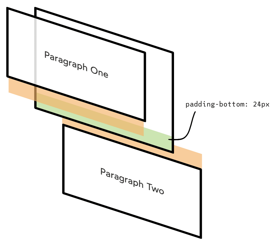
You can think of padding/border as a sort of wall; if it sits between two margins, they can’t collapse, because there’s a wall in the way. The width doesn’t matter, either; even 1px of padding will interfere with margin collapse.
So far, all the examples we’ve seen involve adjacent opposite margins: the bottom of one element overlaps with the top of the next element.
Surprisingly, margins can collapse even in the same direction.
Here’s what this looks like in code:
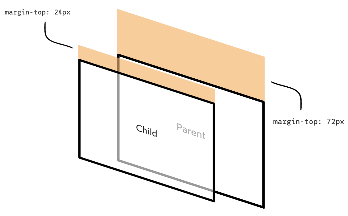
<style>
  .parent {
    margin-top: 72px;
  }
  .child {
    margin-top: 24px;
  }
</style>
<div class="parent">
  <p class="child">Paragraph One</p>
</div>
You can think of this an extension of the previous rule. The child margin is getting “absorbed” into the parent margin. The two are combining, and are subject to the same rules of margin-collapse we’ve seen so far (e.g. the biggest one wins).
This can lead to big surprises. For example, check out this common frustration:
<style>
  .blue {
    background-color: lightblue;
  }

  .pink {
    background-color: lightpink;
  }

  p {
    margin-top: 32px;
  }
</style>

<section class="blue">
  <p>Paragraph One</p>
</section>
<section class="pink">
  <p>Paragraph Two</p>
</section>
In this scenario, you might expect the two sections to be touching, with the margin applied inside each <section> container, as left part shows:
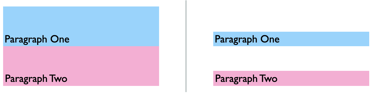
This seems like a reasonable assumption, since the <section>s have no margin at all! The intention seems to be to increase the space within the top of each box, to give the paragraphs a bit of breathing room.
The trouble is that 0px margin is still a collapsible margin. Each section has 0px top margin, and it gets combined with the 32px top margin on the paragraph. Since 32px is the larger of the two, it wins.
Margin-blocked
This rule and the previous one tend to catch people off-guard; nobody expects margins to be allowed to merge with parent containers!
What if we wanted to disable this behaviour?
CSS lets us fortify the bounds of an element with
display: flow-root;.This declaration is similar to
display: block, the default value for most HTML elements, but offers one trick up its sleeve: it creates a new Blocking Formatting Context (BFC).In a standard HTML document with no added CSS, there is only one BFC, and it exists at the root of the document (the
<html>tag). It’s hard to explain exactly what a BFC is, but you can think of it as group of elements following typical “flow” layout rules.When we create a new BFC, it’s like we’re embedding a document within a document. And the bounds of that document are solid steel. No margins will be able to pass through.
display: flow-rootis often used to clear floats, since floated elements also can’t pass through the steel bounds. But we can use it to prevent margins from collapsing..parent { display: flow-root; margin: 24px; } .child { margin: 24px; }Be careful that
display: flow-rootis supported by all major browsers, but not Internet Explorer.
Margin collapse isn’t limited to just two margins! It’s hard to see what’s going on, but this is essentially a combination of the previous rules:
Siblings can combine adjacent margins (if the first element has margin-bottom, and the second one has margin-top).
A parent and child can combine margins in the same direction.
Each sibling has a child that contributes a same-direction margin.
Here it is, in code:
<style>
  header {
    margin-bottom: 10px;
  }
  header h1 {
    margin-bottom: 20px;
  }
  section {
    margin-top: 30px;
  }
  section p {
    margin-top: 30px;
  }
</style>
<header>
  <h1>My Project</h1>
</header>
<section>
  <p>Hello World</p>
</section>
The space between our <header> and <section> has 4 separate margins competing to occupy that space!
The header wants space below itself.
The h1 in the header has bottom margin, which collapses with its parent.
The section below the header wants space above itself.
The p in the section has top margin, which collapses with its parent.
Ultimately, the paragraph has the largest cumulative margin, so it wins, and 40px separates the header and section.
Finally, we have one more factor to consider: negative margins.
Negative margins allow us to reduce the space between two elements. It lets us pull a child outside its parent’s bounding box, or reduce the space between siblings until they overlap.
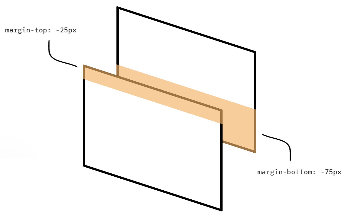
How do negative margins collapse? Well, it’s actually quite similar to positive ones! The negative margins will share a space, and the size of that space is determined by the most significant negative margin. In the above example, the elements overlap by 75px, since the most-negative margin(-75px) was more significant that the other (-25px).
What about when negative and positive margins are mixed? In this case, the numbers are added together. It may lead to margin cancel with each other (e.g. -50px + 50px = 0).
This is a hacky fix in certain situations.
What if we have multiple margins competing for the same space, and some are negative?
If there are more than 2 margins involved, the algorithm looks like this:
header {
  margin-bottom: -20px;
}

header h1 {
  margin-bottom: 10px;
}

section {
  margin-top: -10px;
}

section p {
  margin-top: 30px;
}

<header>
  <h1>My Project</h1>
</header>
<section>
  <p>Hello World</p>
</section>
In this example, we wind up with 10px of realized margin.
So far, all the examples we’ve seen have assumed that we’re “in-flow”; we’re not repositioning things with Grid or Flex.
When items are aligned with either Grid or Flexbox, or taken out-of-flow (e.g. floats, absolute positioning), margins will never collapse.
Frank Lin
Web Notes
2016.08.20
Liquid is a simple template language that Jekyll uses to process pages for your site. With Liquid you can output complex contents without additional plugins.

JavaScript Notes
2018.12.17
JavaScript is a very function-oriented language. As we know, functions are first class objects and can be easily assigned to variables, passed as arguments, returned from another function invocation, or stored into data structures. A function can access variable outside of it. But what happens when an outer variable changes? Does a function get the most recent value or the one that existed when the function was created? Also, what happens when a function invoked in another place - does it get access to the outer variables of the new place?

Tutorials
2020.01.09
IKEv2, or Internet Key Exchange v2, is a protocol that allows for direct IPSec tunnelling between networks. It is developed by Microsoft and Cisco (primarily) for mobile users, and introduced as an updated version of IKEv1 in 2005. The IKEv2 MOBIKE (Mobility and Multihoming) protocol allows the client to main secure connection despite network switches, such as when leaving a WiFi area for a mobile data area. IKEv2 works on most platforms, and natively supported on some platforms (OS X 10.11+, iOS 9.1+, and Windows 10) with no additional applications necessary.